-
Economic Perspectives
Consumer Debt
May 2024
- Filename
- Economic Perspectives MAY 2024.pdf
- Format
- application/pdf

TRANSCRIPT
Last year, when the balance of credit card debt exceeded $1 trillion dollars, it gathered a lot of news headlines that focused on household leverage. When looking at the broader picture of consumer borrowing, it’s up $3.5 trillion dollars since the end of 2019, right before the pandemic set in. The economic implications of consumer debt are far more complicated than just a news headline.
On the positive side, consumer debt helps increase consumer spending, which is the primary driving force of this economy. It makes up about two-thirds of GDP. On the downside, it’s an extension of credit and there’s always the risk of delinquency and default.
So, let’s look at some of the charts.
Chart 1: Credit Card Balance: Nominal & Inflation Adjusted
$, trillions, not seasonally adjusted
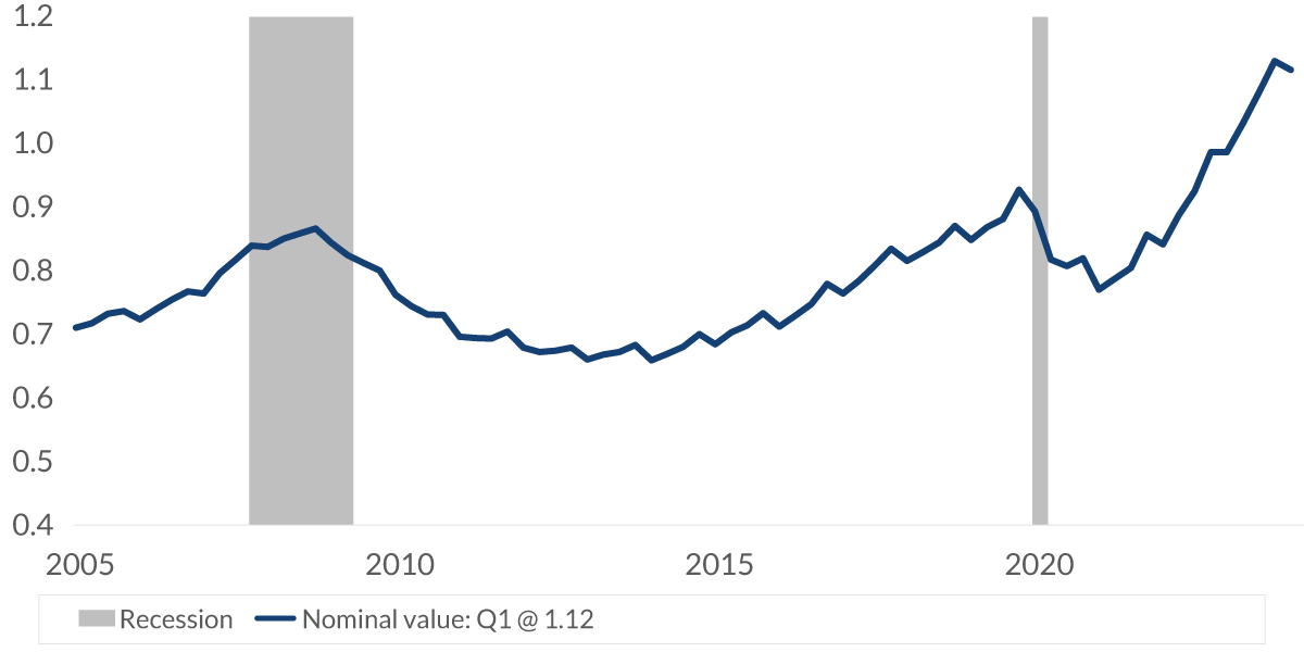
Data current as of May 22, 2024, Inflation adjusted by the Consumer Price Index
Sources: Federal Reserve Bank of New York, Bureau of Labor Statistics
Information is subject to change and is not a guarantee of future results.
Chart 1 0:59– This chart shows the growth of credit card balances with data going back to the early 2000s. In 2005, the balance was around $700 billion dollars, but now it stands at $1.12 trillion dollars. In June of last year, it passed the $1 trillion dollar mark, a larger number than I mentioned earlier, but then it received an awful lot of attention.
But this number is nominal. It’s not adjusted for inflation. The light blue line here shows that when adjusted for inflation, the amount that’s being borrowed is equal to about $700 billion dollars. In fact, it is below the 2005 level, and it stands about 20% below the peak it reached in late 2008 during the global financial crisis. Since 2005, the population has increased; there are 22 million more people working now compared to then, and their income, of course, has grown. Now, the impact of inflation can be sizable when looking at data over a long period of time, like almost 20 years.
Chart 2: Credit Card Balance: Nominal & Inflation Adjusted
$, trillions, not seasonally adjusted

Data current as of May 22, 2024, Inflation adjusted value by the Consumer Price Index
Sources: Federal Reserve Bank of New York, Bureau of Labor Statistics
Information is subject to change and is not a guarantee of future results.
Chart 2 2:04– To look at it over a shorter period of time, this is the same analysis, but the start date is at the end of 2019, right before the pandemic started. Again, the current inflation-adjusted data is below the starting level.
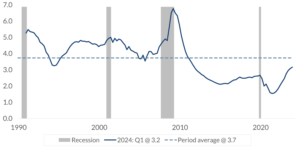
Chart 3: Credit Card Debt: Balance as a Percent of Limit
$ trillion, %, not seasonally adjusted

Data current as of May 22, 2024
Sources: Federal Reserve Bank of New York, Bureau of Labor Statistics
Information is subject to change and is not a guarantee of future results.
Chart 3 2:20– Regarding the access to credit, the dark blue line shows the 1.12 trillion being used. The light blue line, which shows the maximum limit allowed, is 4.9 trillion.
The important part of this chart is the light blue columns that show the percentage of the limit being accessed, which is currently 24%. And as you can see, the percentage moves in a minimal range of between 20% and 28%. Clearly, the people that are borrowing money on their credit card are not running up large balances.
Chart 4: Consumer Loans: Interest Rates (%)

Data current as of May 22, 2024
Sources: Federal Reserve Bank, Bankrate.com
Information is subject to change and is not a guarantee of future results.
Chart 4 2:54– This chart shows the change in interest rates on common consumer loans. On the left is credit cards. The gray is the level it was before the pandemic started. The light blue level is just one year ago, and the dark blue is the current quarter’s data. Clearly, interest rates have been moving up, and the higher financing costs are beginning to impact consumer behavior.
Chart 5: Non Mortgage Interest Payments as a
Percent of Disposable Personal Income
%, seasonally adjusted

Data current as of May 22, 2024
Source: Bureau of Economic Analysis
Information is subject to change and is not a guarantee of future results.
Chart 5 3:18– This chart shows non-mortgage interest payments as a percent of disposable personal income, which is the money you have after you’ve paid your taxes. So, it’s the money you have to do with whatever you want: spend it, save it, invest it, give it away. In the five years before the pandemic, you could see that it was very stable at around 2%. But following the pandemic recession, it fell as interest rates declined, and the light blue line shows when the Fed began to raise interest rates. Since then, these interest payments have moved up about a half a percentage point.
This implies that interest payments are now 25% higher than before the pandemic, so it will influence consumer balance sheets.
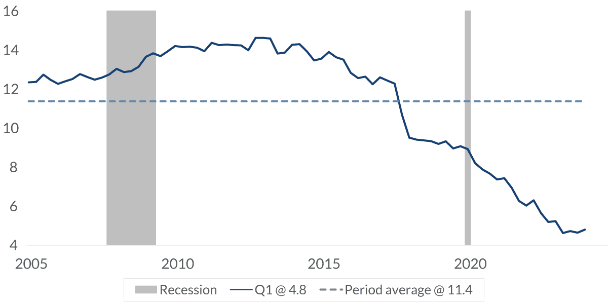
Chart 6: Delinquency Rates for Credit Card Loans
%, seasonally adjusted
Data current as of May 22, 2024
Source: Federal Reserve Bank
Information is subject to change and is not a guarantee of future results.
Chart 6 4:02– The higher interest rates may be the primary cause of increased delinquency rates on credit card loans. However, the increase is from a relatively healthy starting point of household balance sheets as consumers have been paying down debt over the past several years. The current level is still well below the long-term average, but the debt story needs to broaden out.
Chart 7: Consumer Debt Outstanding
% of total, seasonally adjusted, as of 2024:Q1

Data current as of May 22, 2024, Inflation adjusted value by the Consumer Price Index
Sources: Federal Reserve Bank of New York Credit Panel, Equifax
Information is subject to change and is not a guarantee of future results.
Chart 7 4:24– Credit cards make up just 6% of consumer debt. Mortgages are the lion’s share with more than two-thirds of total consumer debt.
Chart 8: Consumer Debt Outstanding
$ trillions, not seasonally adjusted

Data current as of May 22, 2024, Inflation adjusted value by the Consumer Price Index
Sources: Federal Reserve Bank of New York Credit Panel, Equifax
Information is subject to change and is not a guarantee of future results.
Chart 8 4:33– Total consumer debt stands at 17.7 trillion, about 3.5 trillion above where it was at the end of 2019. But adjusted for inflation, the light blue line, you can see it’s about the same level as it was in 2005.
Chart 9: Delinquency Rates
%, seasonally adjusted

Data current as of May 22, 2024
Sources: Federal Reserve Bank
Information is subject to change and is not a guarantee of future results.
Chart 9 4:49– Here, we’re going to look at delinquencies in a little bit more detail. For the long-term perspective, the gray columns show the average delinquencies for various consumer loans for which the Fed publishes data.
This is showing the average of the 15 years before the pandemic. The light blue columns show the delinquency rate one year ago. In all cases, the delinquency rate a year ago was lower than the long-term average. It’s most noticeable in residential loans or mortgages. That has to do with the stringent changes in mortgage qualifications that were put in place following the global financial crisis. The gray columns, the 15-year data, includes that period and that’s why it’s much higher.
Now let’s look at the current level of delinquencies. That’s the dark blue columns. Again, all are below the long-term average, but mortgages are a little lower than a year ago. Commercial real estate has moved up a tad from a year ago, which, of course, is not surprising considering all the news articles about vacancies at offices in some major cities. Credit card delinquencies have increased slightly since last year as we discussed earlier. The two remaining categories, the other consumer loans and commercial and industrial loans, haven’t moved much from last year but are below the long-term average.
Overall, the delinquency story being below the long-term averages is not much of a concern on a macroeconomic level. The financial strength of most households is the reason why delinquencies are near historically low levels, and this can be seen in the next two charts.
Chart 10: Household Debt Service Ratio
total required household debt payments to total disposable income
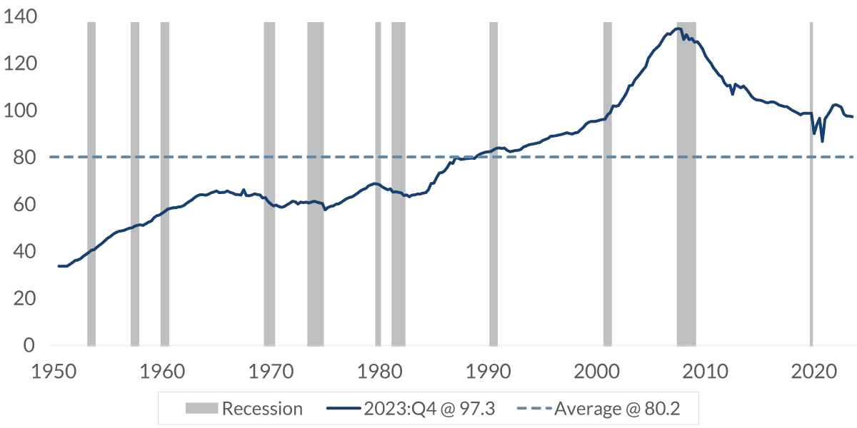
Data current as of May 22, 2024
Sources: Federal Reserve Bank, Bureau of Economic Analysis
Information is subject to change and is not a guarantee of future results.
Chart 10 6:31– This chart shows the total amount of debt that is owed relative to disposable income. Although it’s higher than the long-term average from the 1950s, it’s much better than it has been in the past 20 years. And I’m not so sure it’s fair to compare it to the 1950s, ’60s and ’70s because access to credit wasn’t as easy back then. It really wasn’t until the 1980s that credit cards became an easy way to purchase goods and services.
Chart 11: Household Debt Service Ratio
total required household debt payments to total disposable income

Data current as of May 22, 2024
Sources: Reserve Bank, Bureau of Economic Analysis
Information is subject to change and is not a guarantee of future results.
Chart 11 7:00– This chart is more important than the previous one because it measures the required household payment relative to the total disposable income. The previous chart showed the total amount that was due. This chart shows what the monthly payment must be. An example would be that the previous chart showed the total amount of the mortgage, while this one shows what the required monthly payment is. And here, you can see it’s hovering at all-time lows.
Chart 12: Third Party Collections Proportion
with Consumers with Collection
%, not seasonally adjusted
Data current as of May 22, 2024
Source: Federal Reserve Bank of New York Credit Panel, Equifax
Information is subject to change and is not a guarantee of future results.
Chart 12 7:27– This chart I found interesting. I’m a little unsure how important it is in understanding credit or debt, but I found it interesting that the New York Fed monitors this. The chart shows a percentage of debt collection from a third party. And based on this, creditors don’t need outside parties to collect their debt right now since it’s extremely low.
Yes. There’s a lot of debt out there. However, adjusted for inflation, it has remained relatively stable. Delinquencies are manageable at this stage, and the balance sheet of those borrowing money is quite solid. The higher interest rates have raised the risk of the ability of some to borrow. And at this stage of the economic cycle, managing debt is not a macroeconomic issue.
The bigger issue going forward is how much the higher interest rate on the debt will slow down consumer spending, again, the major driving force of GDP. But generally speaking, as long as the unemployment rate stays below 5%, it implies a robust economy where households can service their debt. And when the unemployment rate increases due to a weakening of the economy, that’s the time to start worrying about debt. But that’s not the scenario at this stage right now.
Important Information
The information presented does not involve the rendering of personalized investment, financial, legal, or tax advice. This presentation is not an offer to buy or sell, or a solicitation of any offer to buy or sell any of the securities mentioned herein.
Certain statements contained herein may constitute projections, forecasts and other forward-looking statements, which do not reflect actual results and are based primarily upon a hypothetical set of assumptions applied to certain historical financial information. Viewers are cautioned that such forward-looking statements are not a guarantee of future results, involve risks and uncertainties, and actual results may differ materially from those statements. Certain information has been provided by third-party sources and, although believed to be reliable, it has not been independently verified and its accuracy or completeness cannot be guaranteed.
Any opinions, projections, forecasts, and forward-looking statements presented herein are valid as of the date of this video’s distribution and are subject to change.
Past performance or performance based upon assumptions is no guarantee of future results.
All investing is subject to risk, including the possible loss of the money you invest. As with any investment strategy, there is no guarantee that investment objectives will be met and investors may lose money. Diversification does not ensure a profit or protect against a loss in a declining market.
City National Rochdale, LLC is an SEC-registered investment adviser and wholly-owned subsidiary of City National Bank. Registration as an investment adviser does not imply any level of skill or expertise. City National Bank is a subsidiary of the Royal Bank of Canada. City National Bank provides investment management services through its subadvisory relationship with City National Rochdale. Brokerage services are provided through City National Securities, Inc., a wholly-owned subsidiary of City National Bank and Member FINRA/SIPC.
© 2024 City National Bank. All rights reserved.
CITY NATIONAL ROCHDALE, LLC NON-DEPOSIT INVESTMENT PRODUCTS ARE: • NOT FDIC INSURED •NOT BANK GUARANTEED •MAY LOSE VALUE
Stay Informed.
Get our Insights delivered straight to your inbox.


Put our insights to work for you.
If you have a client with more than $1 million in investable assets and want to find out about the benefits of our intelligently personalized portfolio management, speak with an investment consultant near you today.
If you’re a high-net-worth client who's interested in adding an experienced investment manager to your financial team, learn more about working with us here.