-
Economic Perspectives
Housing
August 2024
- Filename
- Economic Perspectives AUGUST 2024.pdf
- Format
- application/pdf

TRANSCRIPT
Let’s talk about housing. Housing is an important aspect of the economy. It provides shelter at the primary level, but it’s also an asset, and for most American homeowners, it’s the most valuable asset that they have. The value of a home has grown significantly since the pandemic, a much faster pace than what the average was for the previous decades. This month, we’ll take a look at many of the factors that are impacting their value.
Chart 1: House Price Index: FHFA U.S. House Price Index
% change y-o-y, not seasonally adjusted
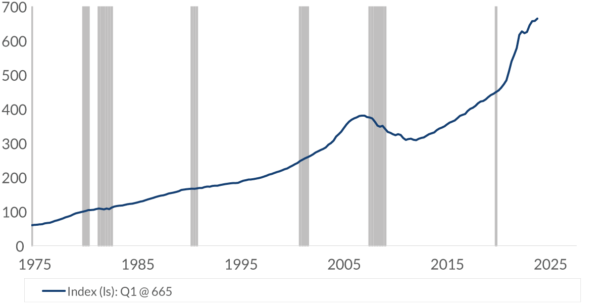
Data current as of August 26, 2024
Sources: Federal Housing Finance Agency
Information is subject to change and is not a guarantee of future results.
Chart 1, 0:46– This chart has home pricing data going back almost 50 years. It measures the average price changes for repeat sales and refinancing of the same property, and it does so for 363 metropolitan areas. The chart generally has an upward trend, but you can see, a little after 2005, that the price moved down a bit. That, of course, was the housing crisis associated with the global financial crisis.
But this is an interesting part — the light-blue shaded area measures the yearly change in the price. Aside from the housing crisis in one quarter in 1982, for almost 50 years, the yearly price change has been positive. I’ll tell you, there aren’t many asset classes that can state that claim.
Chart 2: Home Price Index: FHFA U.S. House Price Index
%, historical change, seasonally adjusted

Data current as of August 26, 2024
Sources: Federal Housing Finance Agency
Information is subject to change and is not a guarantee of future results.
Chart 2, 1:35– Here, you can see the change in the price of the index over different time periods. For example, in the past 10 years, there’s been a 100% increase in the value of the home: That’s a doubling in price — very impressive.
The light-blue line here shows the annualized rate for the same periods. The price increase of the last few years has been stronger than the long-term averages. As an investment return, remember that most people buy a home with a mortgage, so it’s a leveraged purchase that’s financed at a relatively low rate. Roughly speaking, with 20% down, the return on investment is about five times greater than what the return is that you see here. That, of course, excludes items like financing costs, property taxes, maintenance and so forth.
Chart 3: Home Prices
% change since just before the pandemic recession, seasonally adjusted

Note: Price change from January 2019 to May 2024
Data current as of August 26, 2024
Source: S&P CoreLogic Case-Shiller
Information is subject to change and is not a guarantee of future results.
Chart 3, 2:25– As the age-old real estate maxim goes, the three most important factors [in] investing in real estate are location, location and location. This chart shows the price change of the home index for 20 primary cities since just before the pandemic started. You can see the national average in light blue is at 48.9%. The cities above that are generally the southern part of the country, and it’s where most people moved once they realized they did not need to live near the city that they worked in. The one exception, of course, is New York City, but let’s face it: New York City is a special place for a whole host of reasons.
As for the cities below the average, many are cities that people moved from. The most notable is at the bottom: San Francisco. Many workers there were in the tech industry, a profession that easily allows for remote working.
Chart 4: Monthly Mortgage Payment -
Median Price of Existing Home
$, 30-year fixed rate mortgage, 80% financing
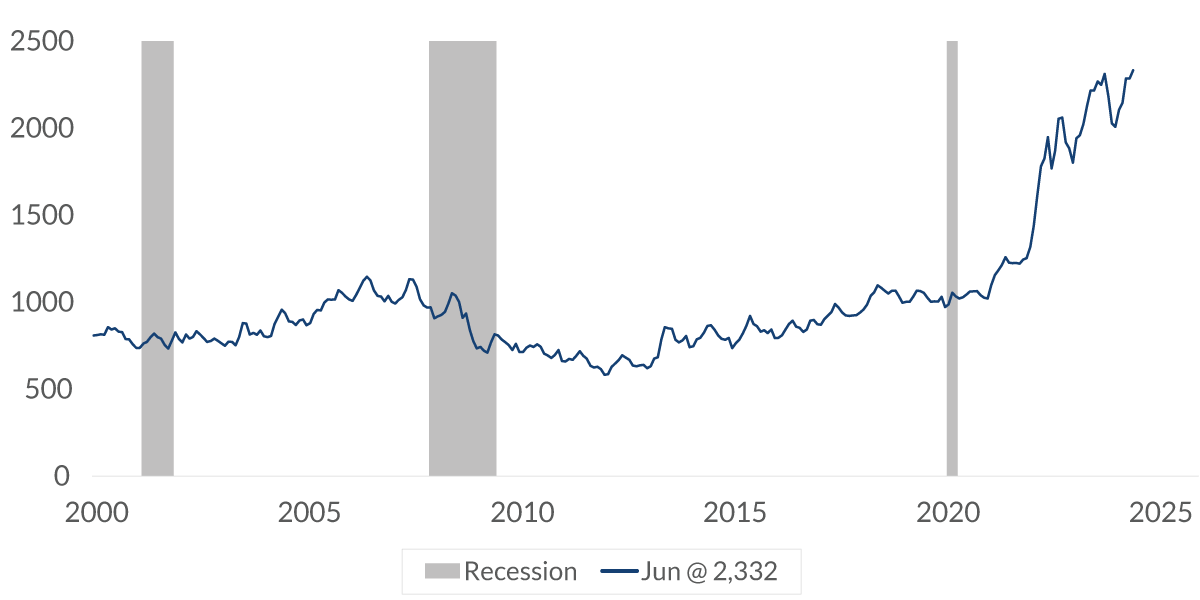
Data current as of August 26, 2024
Sources: National Association of Realtors, Bankrate.com, CNR Research
Information is subject to change and is not a guarantee of future results.
Chart 4, 3:23– With the price increases, this makes buying a home expensive. This chart here shows the cost of a monthly mortgage payment for a medium-priced existing home at the prevailing mortgage rate. For the 20 years before the pandemic, the monthly mortgage payment went up by $163 to $972 — that’s an increase of about 20%. But since 2020, the cost of the monthly mortgage payment has more than doubled. It has jumped $1,360 to a total of $2,332. That’s due to the increased cost of the home and the jump in mortgage rates.
To be fair, incomes have also increased during that same period of time, and you can see how that plays through in the following chart.
Chart 5: Mortgage Payment as a Percent
of Median Family Income
%, based on an 80% loan to value mortgage
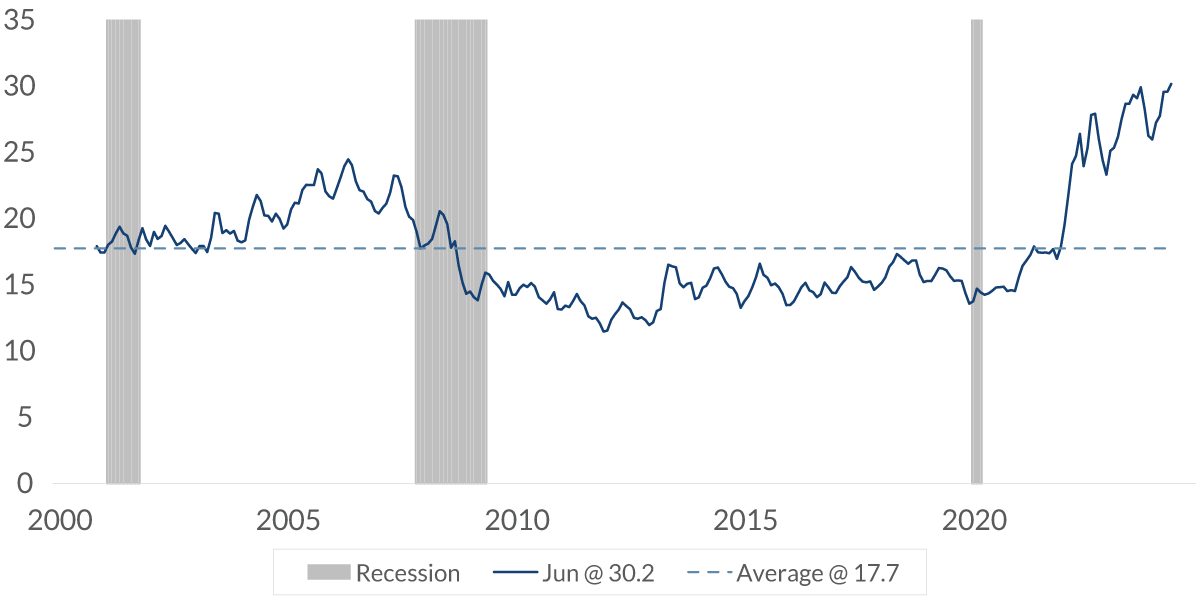
Data current as of August 26, 2024
Sources: U.S. Census Bureau, National Association of Realtors, Bankrate.com, CNR Research
Information is subject to change and is not a guarantee of future results.
Chart 5, 4:15– Here, we’re looking at the mortgage payment as a percent of median family income. It’s high. It now stands at 30.2%, almost twice the long-term average of 17.7%.
Yes, it’s further confirmation that housing is expensive. When was it low? Well, in early 2012. At that point, it was after the housing crisis, when home prices had fallen about 25%, and the demand for an awful lot of those homes was just not there.
Chart 6: Share of New Home Sales, Based on Price ($ '000)
% of total, not seasonally adjusted
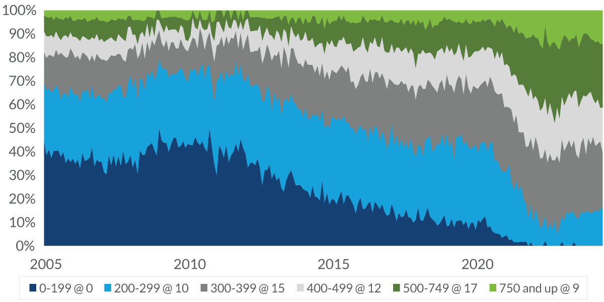
Data current as of August 26, 2024
Source: U.S. Census Bureau
Information is subject to change and is not a guarantee of future results.
Chart 6, 4:50– This is an interesting chart: This chart shows the share of new-home sales based on the price of the home. Look at the dark blue in the bottom-left corner. You can see for the decade after 2000, about one-third of all homes were priced under $200,000. Look at the light blue right above it. About two-thirds of all homes that were sold were priced at $300,000 or less. Now look at the bottom right, the current time. There is not a measurable number of homes that are priced under $200,000, and just 10% of all homes that were sold were under $300,000. Times have changed, and homes are more expensive.
Chart 7: Housing Starts: Single Family
'000, units, seasonally adjusted annual rate
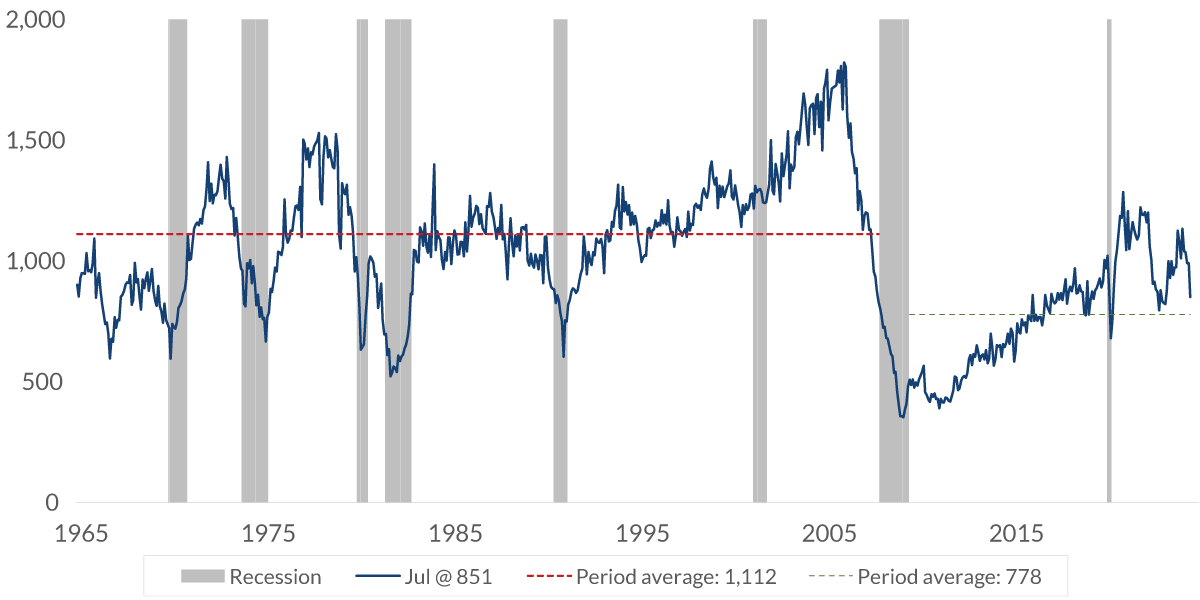
Data current as of August 26, 2024
Source: U.S. Census Bureau
Information is subject to change and is not a guarantee of future results.
Chart 7, 5:39– One of the primary reasons why home prices are so high is because the supply has not held up for the demand.
This chart here shows the number of single-family homes built since 1965. Looking at the red line, you can see that the average number of homes being built was 1.1 million per year, but since the housing crisis, that has averaged to fewer than $800,000 — that’s just 70% of the 1965 to 2007 average.
It’s not like the population shrank during that period of time. There are just not enough homes available in the market.
Chart 8: Mortgage Rates (%)
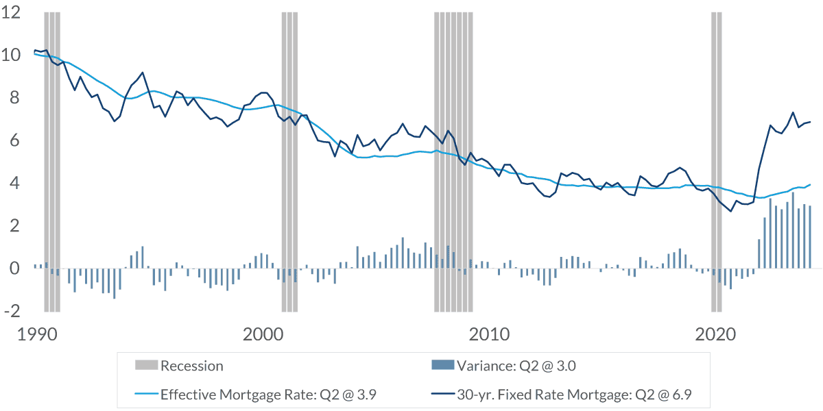
Data current as of August 26, 2024
Sources: Freddie Mac Commitment Rate, Bureau of Economic Analysis
Information is subject to change and is not a guarantee of future results.
Chart 8, 6:19– That was a long-term problem we have going on. Here’s a more contemporary issue that’s impacting supply. The dark-blue line is the current mortgage rate, which is 6.9%. The light-blue line is the effective mortgage rate Americans are paying on their existing mortgage. It’s just 3.9%. Clearly, many people refinanced their mortgage into a fixed-rate level when [it was] just 3% to 4% or maybe even 5%.
The difference between what people are paying and what the market level is is extremely vast. Many people with those low-level interest rates on their mortgage do not want to sell their home because they don’t want the high cost of a new mortgage at the higher interest rate.
Chart 9: New & Existing Home Sales
units, millions, seasonally adjusted annual rate
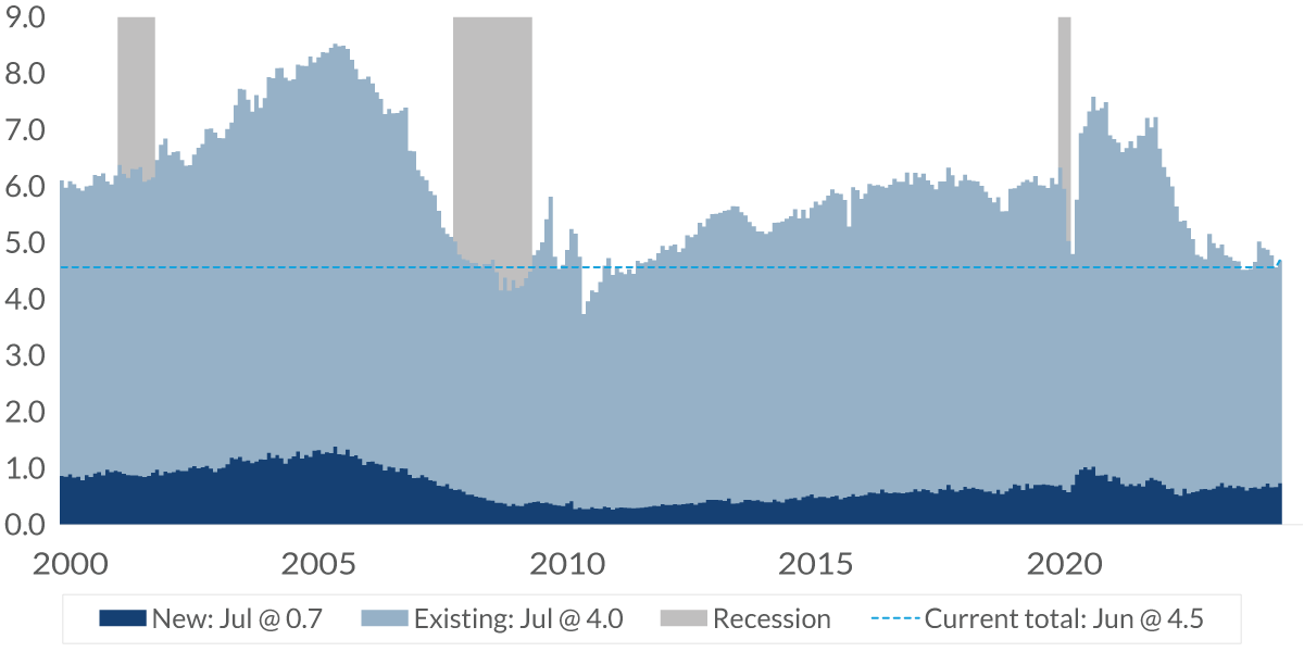
Data current as of August 26, 2024
Sources: National Association of Realtors, U.S. Census Bureau
Information is subject to change and is not a guarantee of future results.
Chart 9, 7:03– You can see in this chart here [that] the light blue is existing-home sales. The dark blue is new-home sales. About 90% of all homes that are sold are an existing home, and herein lies the problem. Those people with the low-level mortgage do not want to sell their home, and as a result, there’s not much supply in the market, and that’s helping to push up the price of homes.
Chart 10: New & Existing Home Sales
units, millions, seasonally adjusted annual rate
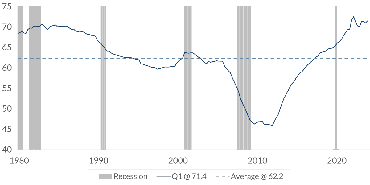
Data current as of August 26, 2024
Source: Federal Reserve Bank
Information is subject to change and is not a guarantee of future results.
Chart 10, 7:26– One of the byproducts of the price appreciation is the fact that many homeowners have positive equity in their home — and that currently stands at a little over 71%, near an all-time high [and] much higher than the level it was before the housing crisis.
So, this means that the risk of another housing crisis is much lower now than it was back then. If you own a home, it’s probably been a very good investment for you, but we’ve seen the volatility. What the market now needs to see is for mortgage rates to come down because that will provide a great deal of normalcy back into the markets.
Important Information
The views expressed represent the opinions of City National Rochdale, LLC (CNR) which are subject to change and are not intended as a forecast or guarantee of future results. Stated information is provided for informational purposes only, and should not be perceived as personalized investment, financial, legal or tax advice or a recommendation for any security. It is derived from proprietary and non-proprietary sources which have not been independently verified for accuracy or completeness. While CNR believes the information to be accurate and reliable, we do not claim or have responsibility for its completeness, accuracy, or reliability. Statements of future expectations, estimates, projections, and other forward-looking statements are based on available information and management's view as of the time of these statements. Accordingly, such statements are inherently speculative as they are based on assumptions which may involve known and unknown risks and uncertainties. Actual results, performance or events may differ materially from those expressed or implied in such statements.
Past performance or performance based upon assumptions is no guarantee of future results.
All investing is subject to risk, including the possible loss of the money you invest. As with any investment strategy, there is no guarantee that investment objectives will be met and investors may lose money. Diversification does not ensure a profit or protect against a loss in a declining market.
City National Rochdale, LLC is an SEC-registered investment adviser and wholly-owned subsidiary of City National Bank. Registration as an investment adviser does not imply any level of skill or expertise. City National Bank is a subsidiary of the Royal Bank of Canada.
© 2024 City National Bank. All rights reserved.
CITY NATIONAL ROCHDALE, LLC NON-DEPOSIT INVESTMENT PRODUCTS ARE: • NOT FDIC INSURED •NOT BANK GUARANTEED •MAY LOSE VALUE
Stay Informed.
Get our Insights delivered straight to your inbox.


Put our insights to work for you.
If you have a client with more than $1 million in investable assets and want to find out about the benefits of our intelligently personalized portfolio management, speak with an investment consultant near you today.
If you’re a high-net-worth client who's interested in adding an experienced investment manager to your financial team, learn more about working with us here.